


Hope to Dream Website Overview
Hope to Dream is Ashley Furniture’s nonprofit initiative dedicated to giving every child a good night’s sleep. Since 2010, the program has provided over 140,000 beds to children in need.
For me, this project carried deep personal meaning. Beyond its design challenges, it was rooted in empathy and storytelling. I even joined one of the bed deliveries — seeing the impact firsthand.
The goal was to transform an overlooked sign-up process into a joyful, inspiring experience that celebrated the program’s mission and encouraged more families and sponsors to get involved.
140k
children in need
42
Ashley HomeStores
32k
Total traffic per
month (99% mobile)
The Challenge
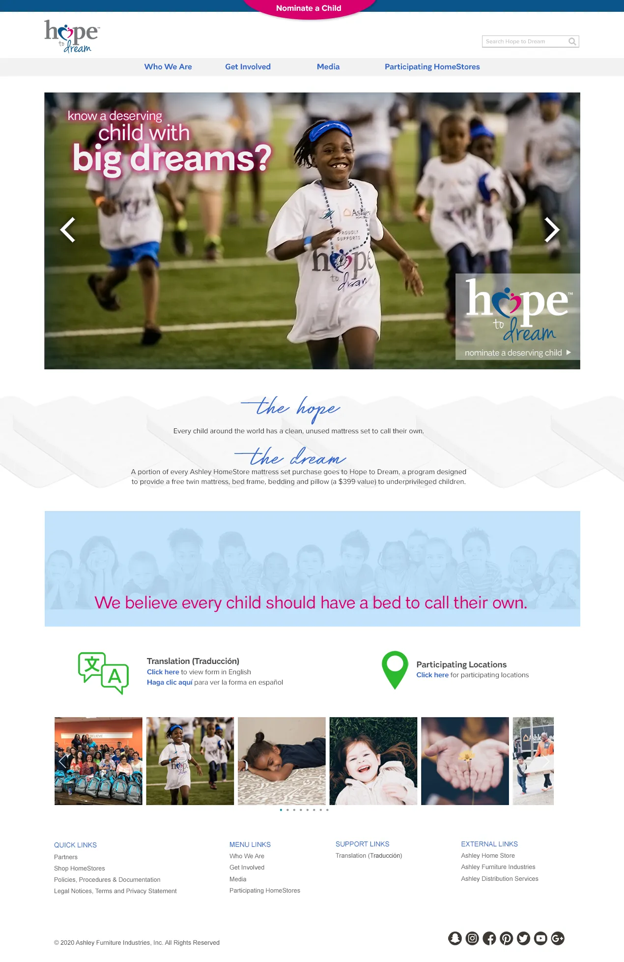
Before the redesign, Hope to Dream existed as a small section buried in Ashley’s corporate site. Families could only access the sign-up form through a link hidden in the footer, which severely limited engagement.
Despite Ashley’s strong community involvement, the program lacked a distinct online identity to match its emotional and social impact. The site needed to:
- Make it easy for families to apply or nominate a child.
- Clearly communicate the program’s mission and real-world impact.
- Inspire new sponsors, volunteers, and retail partners to participate.
I took the initiative to pitch a Moving the form and creating a stand-alone site to the program director — to serve as both an awareness platform and an action hub.
Objectives
I entered the redesign with three guiding principles:
- Clean – Simplify navigation and content hierarchy so users could quickly find the nomination form and learn how to participate.
- Fun – Create an uplifting and colorful experience that reflected the joy of the children who receive the beds.
- Informative – Showcase the scope of the program, highlight real stories, and recognize the partners, volunteers, and employees who make it possible.
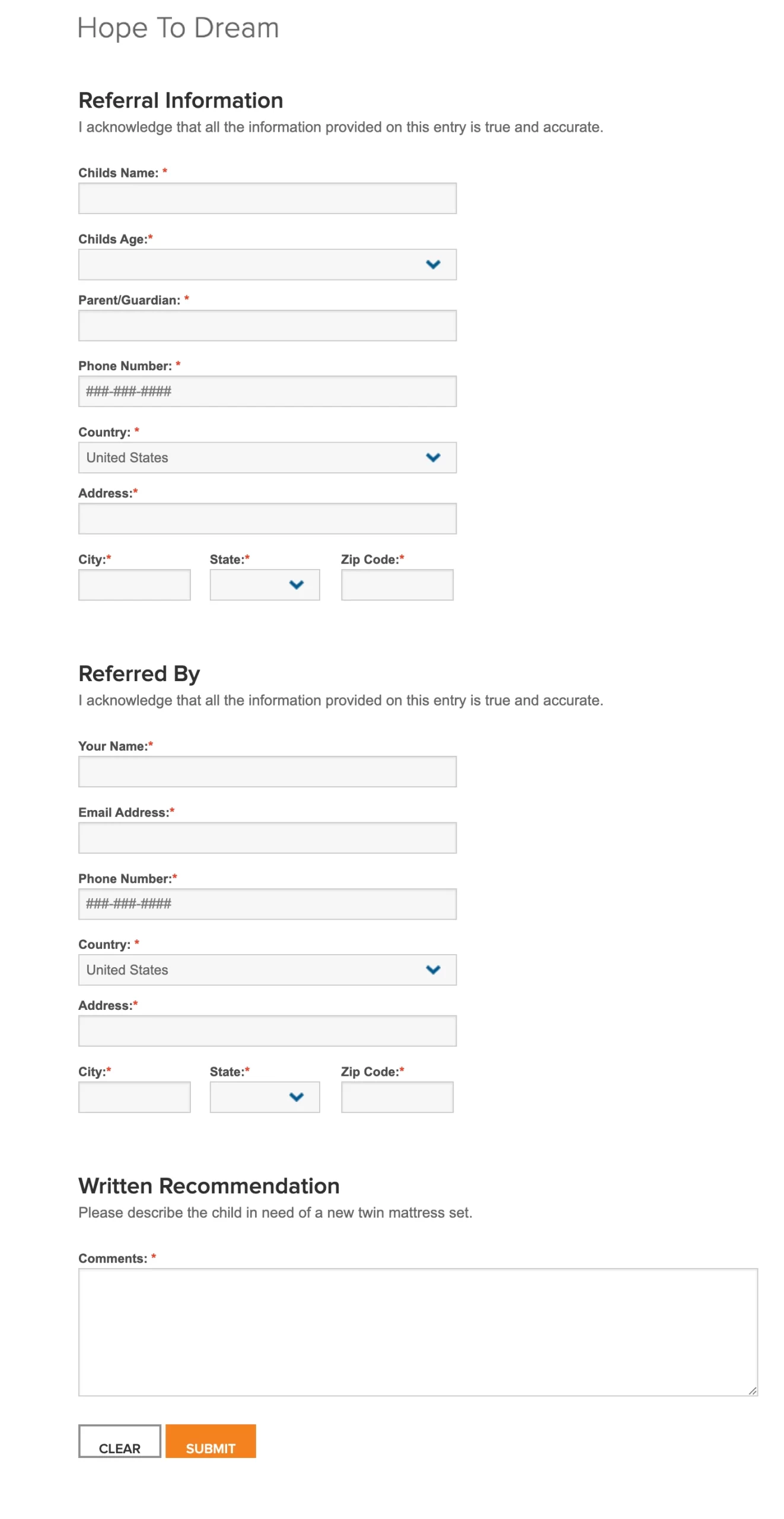
Original submission form
Research & Discovery
Findings:
- Families often heard about the program through word of mouth but couldn’t easily find or complete the form online.
- The previous content was too corporate, lacking warmth and emotional connection.
- There was minimal visibility into where donations go or how recipients are chosen — which discouraged potential sponsors.
These insights guided a design approach focused on transparency, empathy, and action.
Design Strategy
The website was reimagined as both a storytelling platform and an engagement tool.
Each section was crafted to build trust, evoke emotion, and drive conversion — whether that meant applying, donating, or becoming a partner.
Key UX decisions:
- Dedicated navigation: Separate paths for Nominate a Child, Donate, and Partner Stories.
- Hero imagery & storytelling: Large, emotional photos of real children and volunteers replacing stock imagery.
- Simplified form experience: Clear nomination flow with progress indicators and inline validation.
- Community highlights: Carousel featuring local events and success stories to encourage participation.
- Accessibility focus: High-contrast color palette and large tap targets to ensure usability for all visitors.
High-Fidelity Wireframes
Instead of starting with low-fidelity sketches, I moved directly into high-fidelity wireframes, using Ashley’s brand palette but adapting it to feel more child-friendly and hopeful.
I designed all creative assets, including:
- Custom icons to represent community, care, and giving.
- Curated stock photography emphasizing authenticity and emotion.
- Engaging CTA buttons (“Nominate a Child,” “Get Involved,” “Share a Story”) to channel users toward key actions.
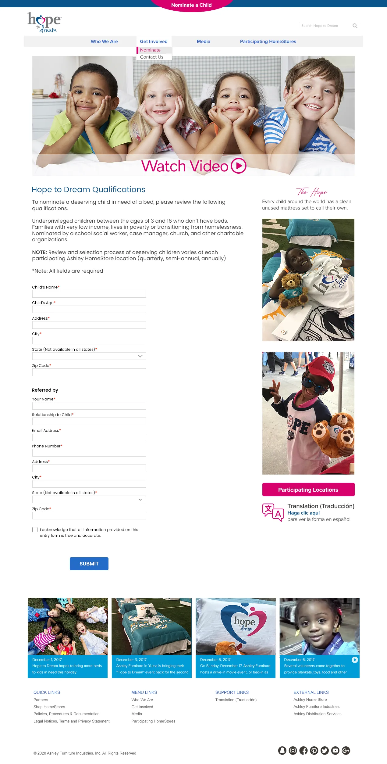
New Hope to Dream Form Page
Impact
- Increased program visibility: The standalone site made Hope to Dream easier to discover via organic search and social media.
- Higher participation: The simplified nomination flow led to a measurable increase in form submissions and community engagement.
- Expanded brand story: The site became a showcase of Ashley’s commitment to giving back — strengthening both its CSR presence and internal culture of service.
- Emotional connection: Feedback from families, partners, and employees reflected pride and inspiration in the brand’s outreach.
Learnings
This project reminded me that great UX isn’t just about usability — it’s about empathy and the meaning.
By focusing on storytelling and accessibility, the Hope to Dream redesign turned a buried form into a meaningful experience that connected people to a mission — and to each other.