


Food Safety Redesign Overview
Highland Hub, the enterprise SaaS platform developed by Highland Ag Solutions, empowers growers, packers, and food-safety professionals to manage compliance, sustainability, and operational documentation.
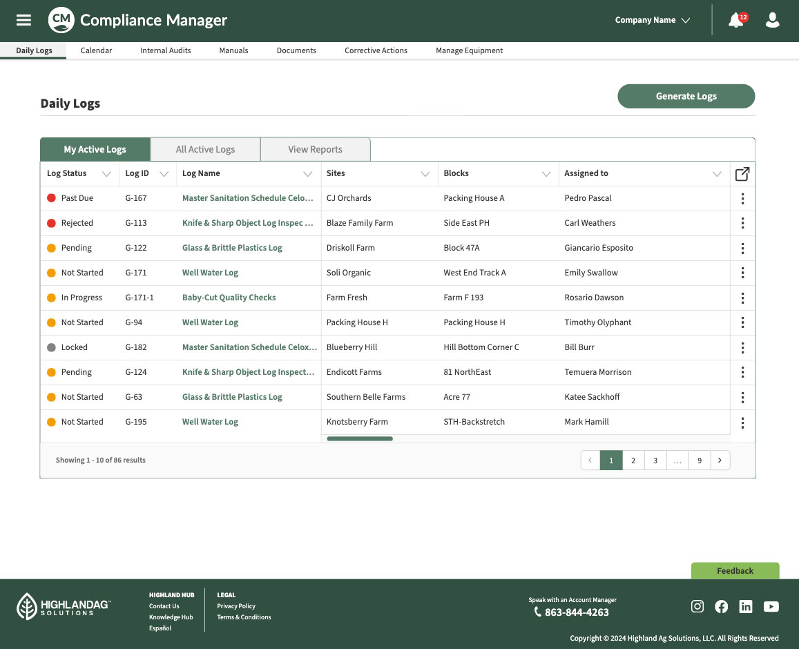
A core feature of its Compliance Manager product (formerly “Food Safety”) is Daily Logs — the essential tool for recording day-to-day activities required by regulatory agencies.
Since incomplete or inaccurate logs can result in costly penalties or audit failures, the redesign focused on building an intuitive, efficient, and adaptable interface that simplifies data entry and strengthens documentation integrity.
The Challenge
At first glance, the task seemed like a straightforward UI refresh. But after auditing the existing Daily Logs module, it became clear that the problems extended beyond layout — reaching into data architecture, endpoint logic, and workflow design across multiple product branches.
Key issues identified:
- Navigation misuse: Radio buttons were being used as links, each loading a separate table view — an unexpected behavior that broke user expectations.
- Filter confusion: External filters applied globally instead of contextually, producing inaccurate search results and creating user frustration.
- Inefficient table structure: Wrapped text and inconsistent column spacing caused tall, hard-to-scan tables with wasted space.
- Naming inconsistencies: Multiple labels (“Create” vs. “Generate”) referred to the same function, leading to cognitive friction and user hesitation.
The deeper I examined the interaction model, the clearer it became that fixing surface-level UI issues wouldn’t be enough. We needed to rethink the information hierarchy and workflow logic from the ground up.
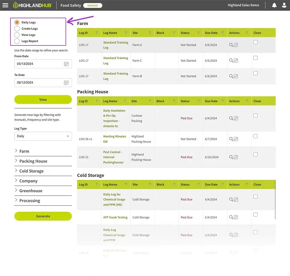
As seen above, the previous workflow caused many challenges including stacked tables.
Research & User Interviews
Before moving into design, we conducted interviews with frequent Daily Logs users — from quality-assurance leads to operations managers — to validate assumptions and uncover overlooked issues.
Key insights:
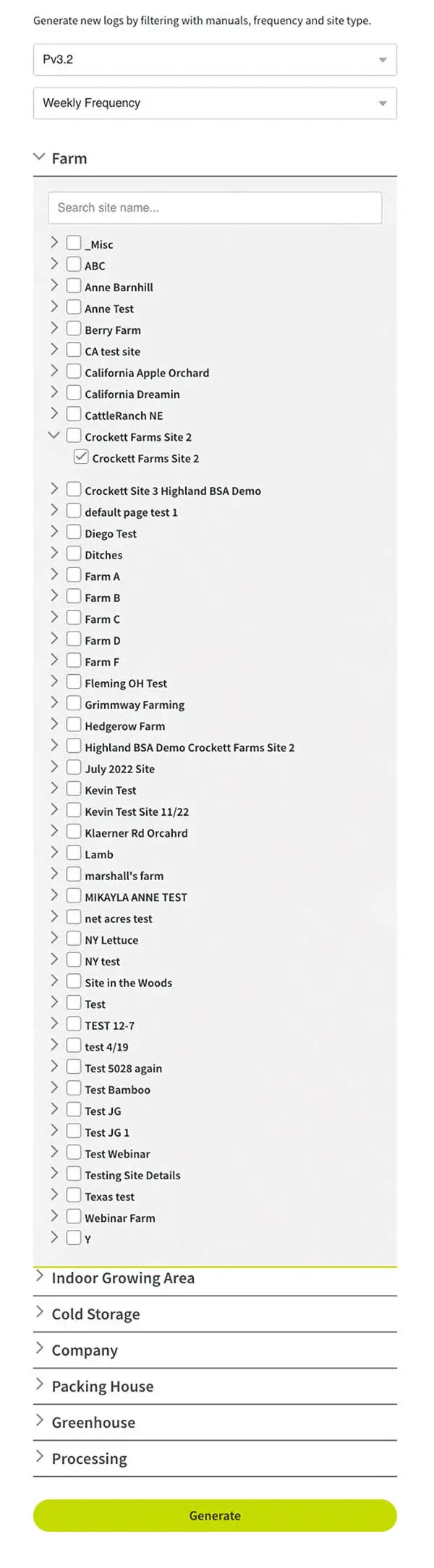
- Users often didn’t know where to start; filter sequences lacked guidance, causing them to choose filters out of order or end up with empty results.
- The oversized accordion component forced excessive scrolling between filter selections and table results, breaking flow and visibility.
- Despite the interface frustrations, participants valued being included in the redesign process. These sessions became a bridge between user feedback and visible product change, fostering engagement and ownership.
This user input grounded our design direction and helped us re-prioritize which features would deliver the highest usability impact.
A Multi-Faceted Approach
The redesign addressed multiple dimensions — from interaction patterns to data structure — ensuring scalability and consistency across the platform.
By restructuring the hierarchy of pages and consolidating similar functions, we were able to create a more logical, task-oriented flow.
Key improvements included:
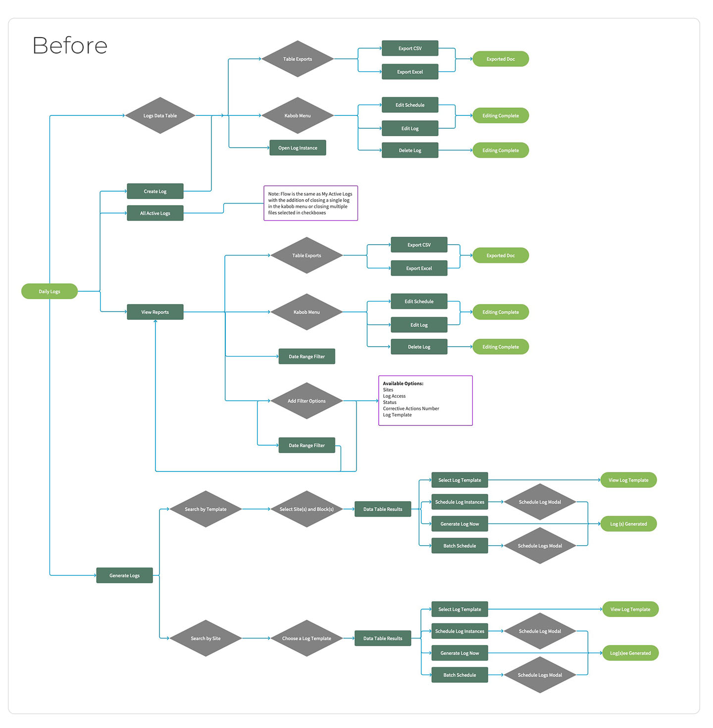
- Replaced radio button navigation with tabbed data tables, offering clear separation of categories without page reloads.
- Embedded filters directly into each data table, aligning filter results with visible content and preventing context loss.
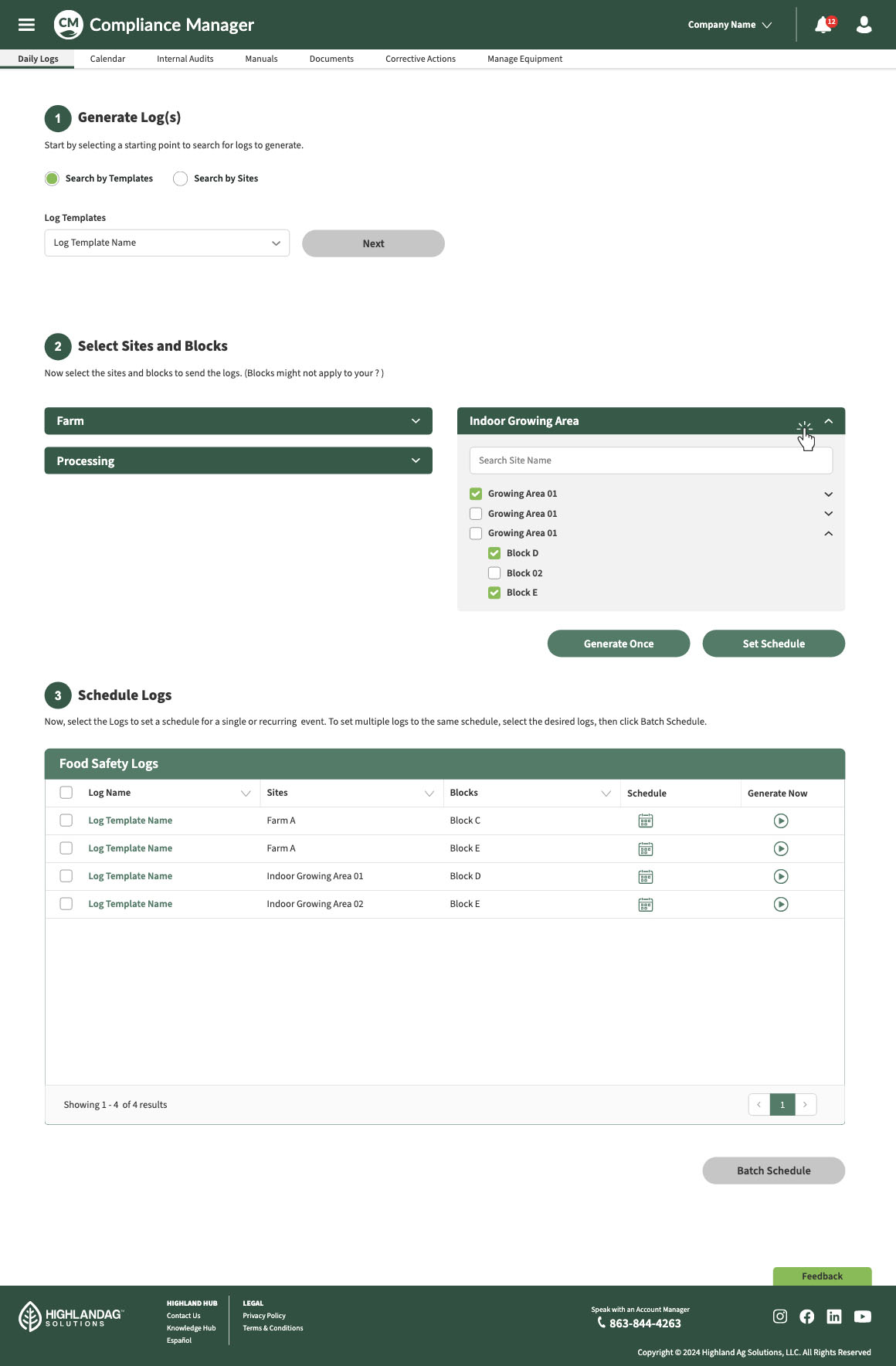
- Introduced a guided 3-step “Create Logs” wizard, breaking complex forms into smaller, focused stages using progressive disclosure.
- Standardized naming conventions and applied the design system’s updated typography and spacing rules to improve clarity and visual rhythm.

High Fidelity Wireframes
Years of stakeholder presentations have shown that high-fidelity wireframes communicate intent far more effectively than abstract sketches.
Because Highland’s Leaf Design System was already well-established, producing detailed prototypes required minimal extra time — yet dramatically improved cross-team alignment and decision-making.
The new screens demonstrate:
- Clean tab-based navigation that eliminates redundant page loads.
- Inline filters and consistent column widths for faster scanning.
- A streamlined “Create Log” wizard that introduces one task at a time, reducing cognitive overload.
Outcomes & Impact
- Improved usability through consistent structure and simplified workflows.
- Reduced data-entry errors and faster onboarding for new users.
- Positive stakeholder feedback during internal demos, leading to adoption of the tab-and-filter model across other Compliance Manager modules.
- The progressive-disclosure pattern introduced here became a reusable UX pattern applied in subsequent redesigns across the Highland Hub ecosystem.
Learnings
This project reinforced a key UX principle: what seems like a simple UI problem often reveals deeper structural challenges.
By addressing architecture, usability, and consistency together, the team created a more scalable, maintainable, and user-friendly solution — one that continues to inform Highland’s ongoing evolution of compliance tools.