Ashley Kiosk Overview
Bridging the Gap Between In-Store and Online Shopping
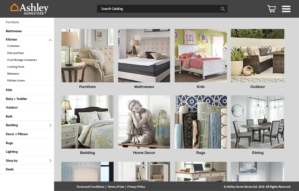
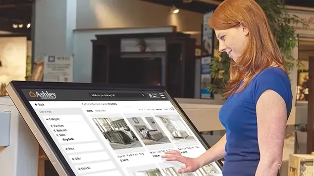
The Ashley Furniture Kiosk enhances customer conversion by offering a quicker and easier way for guests to discover store inventory, while also freeing up valuable time for sales associates. I collaborated with the kiosk technology provider to design an interface that mirrored the shopping experience of our E-Commerce site but was specifically tailored to highlight the store’s unique inventory.
The Challenge
Furniture shopping is a sensory experience — people want to touch, see, and imagine. But Ashley Furniture’s showrooms could only display a fraction of the total product line.
Customers often fell in love with a style only to discover it wasn’t available in that store, or they had to finish their search at home online.
The challenge was clear:
How do we bring Ashley’s entire digital catalog into the physical retail space — without losing the warmth and ease of the in-store experience?
My Role
As Director of User Experience, I led the end-to-end design process: from research and user flows to wireframes, interactive prototypes, and in-store testing. I collaborated closely with IT, Product, and Retail Operations teams, ensuring that what we designed would work both for customers and sales associates on the showroom floor.
The Discovery
We started by observing real customers and sales associates in action.
We noticed three key patterns:
- Showroom overload: With so many styles and SKUs, customers often lost track of what they liked.
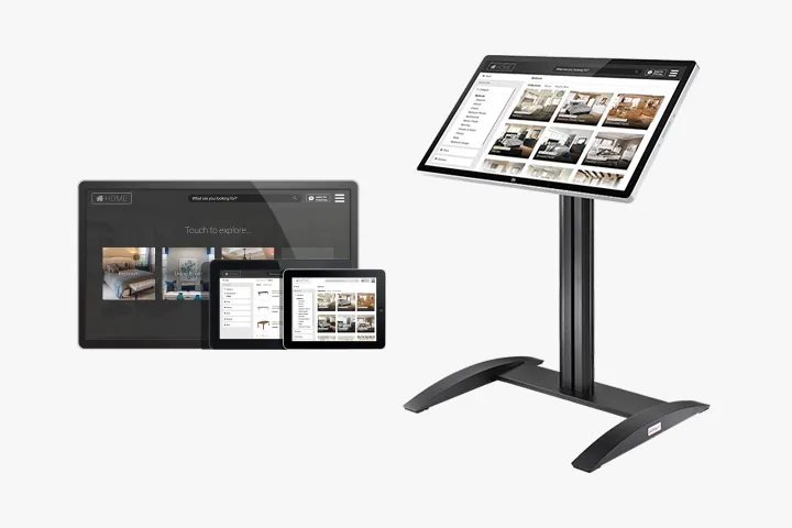
- Large display for wall mount
- Smaller table-top displays
- Tablets to be used by sales associates
- An app for desktop usage
- API for integrating with existing sales apps

Design Approach
- Visual clarity: Large imagery, intuitive icons, and easy-to-read typography for all ages.
- Touch-friendly navigation: Designed for quick browsing on a large touchscreen display.
- Seamless handoff: Users could email themselves their selections or print a quick reference card.
- Brand alignment: Every screen felt unmistakably “Ashley” — warm, modern, and inviting.
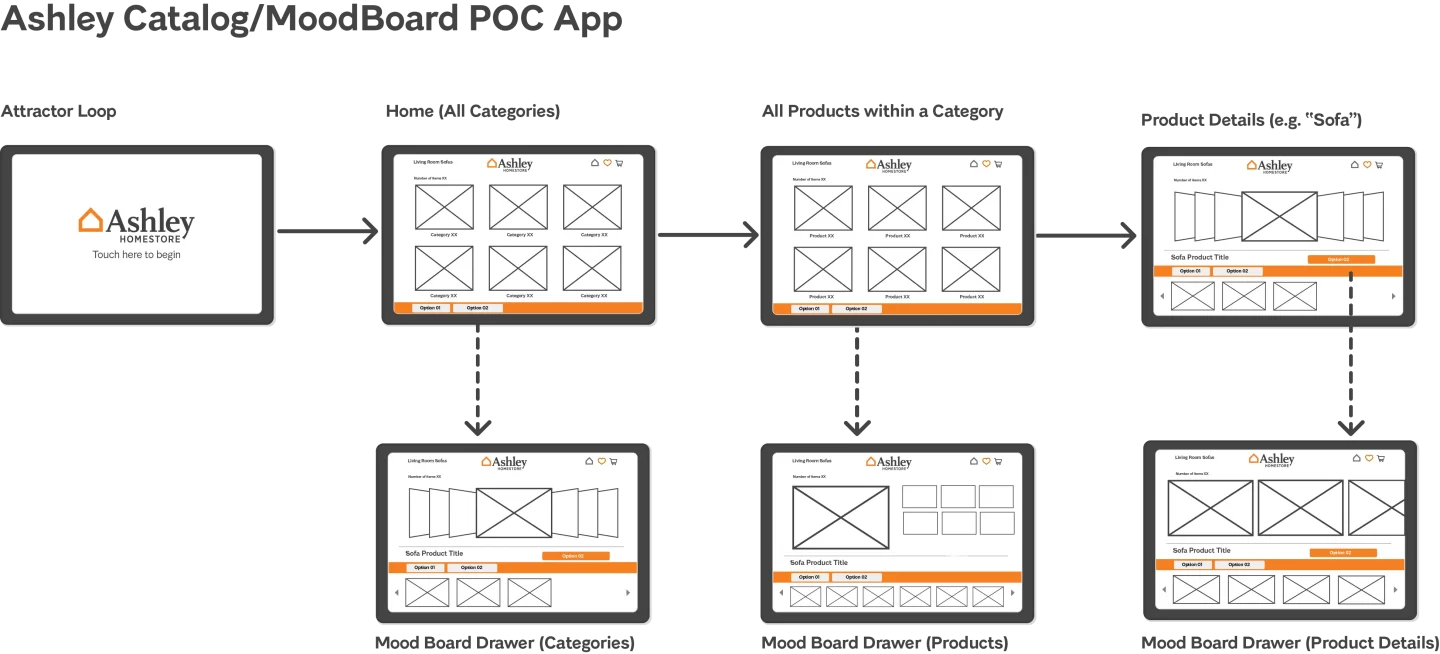
We also designed a dual-mode experience.
- Self-service mode for customers who wanted to explore independently.
- Assisted mode for sales associates to walk through products with customers side-by-side.
Building the Experience
- Search or filter by style, room, color, or price range
- View real-time availability in local and nearby stores
- Check delivery or pickup options instantly
- Save or email product details for later purchase
This design gave customers confidence that what they saw was current and attainable, not just a static display.

The Impact
- More engaged customers: Shoppers spent more time exploring and comparing options.
- Higher conversion: By removing “out-of-stock” roadblocks, more visitors became buyers.
- Smarter insights: Usage data revealed which styles and price points drew the most attention, informing merchandising strategy.
Sales associates especially appreciated that the kiosk doubled as a selling tool, letting them personalize recommendations in real time.
User Feedback
To gain insights for any necessary adjustments, we implemented in-session surveys. These surveys consisted of a quick three-step questionnaire:
“How do you like the kiosk shopping experience?”
“Do you prefer using the kiosk or browsing the store?”
“Is there any feedback that you can provide to make this a better experience?”
Learnings
Designing for a busy showroom meant balancing attention and simplicity — the kiosk had to attract curiosity without overwhelming.
We learned that:
- Clear, consistent visuals drive trust.
- The interface must work equally well for tech-savvy and first-time users.
- Real-time data is everything — customers quickly notice if availability feels outdated.
The success of this project laid the foundation for future in-store digital experiences at Ashley Furniture, including potential AR tools and mobile extensions for associates.
Reflection
This project reminded me that great retail UX is about connection, not just convenience. The kiosk didn’t just make shopping faster — it made it more human. It empowered both the customer and the associate to collaborate, explore, and make confident decisions together.
