


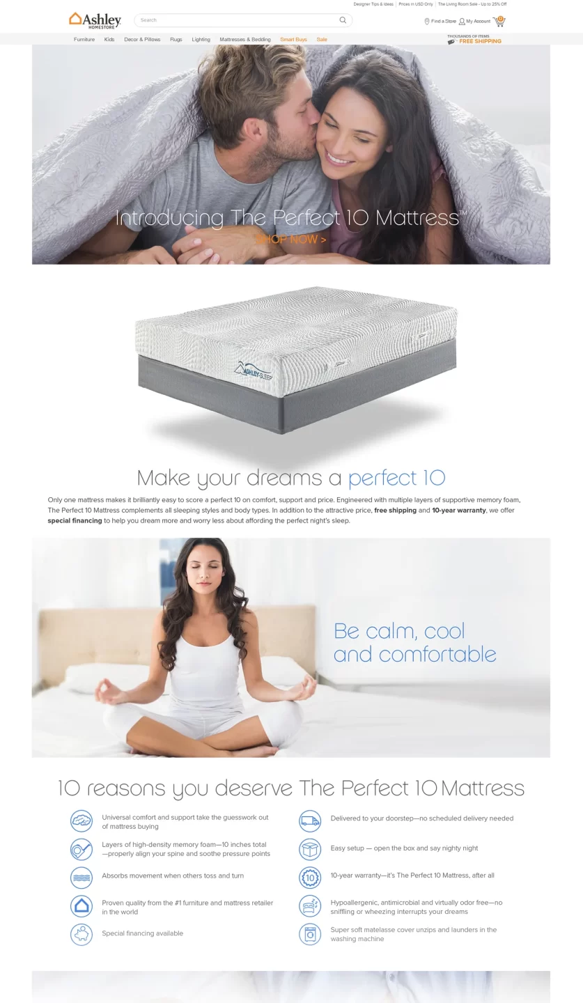
Perfect 10 Mattress
The Perfect 10 Mattress project was one of my first initiatives at Ashley Furniture, created to compete with the new generation of direct-to-consumer mattress brands such as Purple, Casper, and Helix. These startups had begun reshaping the mattress industry—appealing to younger audiences with playful branding, minimal sites, and strong storytelling.
Our vision was to launch an independent e-commerce site that looked and felt like a trendy startup—detached from the corporate identity of Ashley HomeStore.
Although the site was never launched, the project served as an early sandbox for developing Ashley’s approach to rapid prototyping.
Business Requirements vs User Needs
| Business Requirement | User Needs |
| Create a standalone brand identity separate from Ashley HomeStore. | Shop for a mattress that feels modern, fresh, and not part of a big-box store. |
| Capture market share among younger consumers exploring online-only mattress brands. | Get straightforward, authentic information and reviews without sales pressure. |
| Simplify the path to purchase with minimal steps and mobile-first design. | Quickly compare sizes, firmness, and pricing from their phones. |
| Leverage the latest UX tools to explore agile, iterative design methods. | Experience a visually immersive and trustworthy buying journey. |
Project Goals
- Differentiate from Ashley’s traditional retail presence.
- Experiment with new technologies like Adobe XD for rapid iteration.
- Appeal to younger, design-savvy audiences.
- Test minimalist branding, direct-response design, and storytelling.
Research
- Simple, direct messaging focused on comfort and convenience.
- High emphasis on unboxing experiences and lifestyle photography.
- Minimal navigation with scroll-based storytelling.
- Prominent use of trust signals: reviews, return policies, and free-trial banners.
Personas were developed around two archetypes:
-
- The Young Professional – seeking quality sleep and easy delivery.
- The Young Couple – looking for comfort and style without overpaying.
Design
The site’s design embraced simplicity and motion. Large imagery, subtle animation, and concise copy reinforced the brand’s confidence.
Key Features:
- Hero Section: Full-screen visuals showcasing the mattress in minimalist bedroom scenes.
- Configurator Flow: Quick-select options for size, firmness, and shipping.
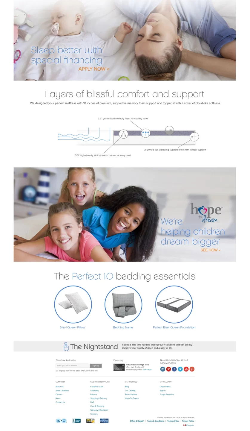
- Scrolling Narrative: Education about materials, construction, and sleep quality integrated within a continuous storytelling layout.
- Reviews + Social Proof: Authentic testimonials and lifestyle photos embedded in-line with content.
- Checkout: Streamlined one-page checkout designed for mobile.
The prototype was built with interactive flows simulating checkout, navigation, and product storytelling. I later applied lessons from this project in Ashley HomeStore’s broader e-commerce redesign, focusing on cleaner layouts and a stronger direct-response tone.
Impact
Although the project never launched, it proved valuable in shaping Ashley’s e-commerce design philosophy. Lessons learned:
- Visual minimalism drives focus—less can indeed sell more.
- Independent branding can re-energize a legacy retailer.
- Mobile-first workflows became a standard for all future initiatives.
This project marked a turning point in my role—helping transition Ashley’s UX practice from legacy retail thinking to modern DTC experiences.
Learnings
- Early use of Adobe XD improved iteration speed and communication with stakeholders.
- Embracing a “startup mindset” inside a large organization encouraged creative risk-taking.
- Story-driven UX and brand separation became vital takeaways for later projects like the Ashley Market Platform and Ashley Kiosk.