


Leaf Design System
When I joined Highland Ag Solutions, it became clear that there were no established design standards, patterns, or best practices guiding the product teams. To address this, I built the company’s first comprehensive design system — a centralized source of truth that included a glossary of industry-specific acronyms, competitive analysis, product branding, and shared terminology accessible across the organization.
The result was The Leaf Design System, a scalable framework supporting multiple products, each with its own distinct brand identity and component library.
The Challenge
- Multiple product teams were each building their own UI components, resulting in inconsistent styling, interaction behaviours and higher dev cost.
- Designers found it difficult to locate the right UI patterns or tokens (colours, typography, spacing) across projects.
- Engineers spent time rebuilding similar components rather than leveraging a shared library.
- Brand voice and visual identity were inconsistently applied across different modules.
Strategy & Approach
Token & Style-Foundation
- Defined colour roles: primary, secondary, success, warning, danger, neutrals, etc.
- Created standardized typography scale (e.g., Heading 1–4, Body, Caption) with font families, sizes, line-heights.
- Elevation/shadow system, border radius system, iconography styling.
Component Library
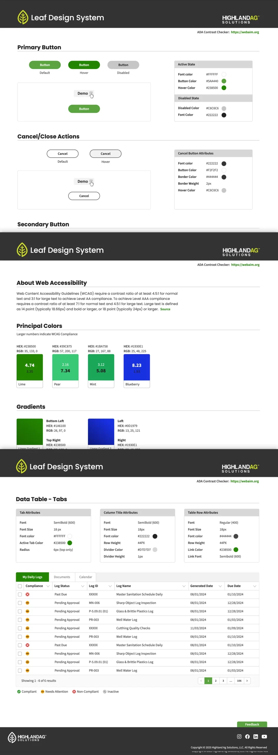
- Built base components: Buttons (primary/secondary/tertiary), Input Fields (text, select, checkbox, toggle), Cards, Lists, Tables, Modal Dialogs.
- Built navigation shells: Top nav, side nav, breadcrumb, tabs.
- Defined patterns: Form layout, Data tables, Responsive grid, Empty state screens, Loading states.
- Ensured accessibility: high-contrast elements, focus states, keyboard navigation, ARIA roles.
Documentation & Governance
- Created a documentation site (via Prototype link) with a menu of pages to browse, components, patterns, usage guidelines, contribution process.
- Established contribution guidelines (how to propose a new component, how to update tokens).
- Ran internal workshops/demos to onboard product teams.
- Provided “starter kit” templates to accelerate new designs.
- Established “champions” in each product team to surface feedback and evangelise Leaf.
Design Process
Phase 1: Audit & Inventory
- Audited existing UI across products: collected UI patterns, tokens in use, discrepancies.
- Documented existing UI elements and grouped similar ones (e.g., button variants).
- Identified redundant components and gaps in the UI.
Phase 2: Define the Foundations
- Held design-workshops with stakeholders to define visual language: brand colour story, typography direction, icon style, spacing scale.
- Created token files and published them for designers/developers.
- Developed a draft design-system style-guide and circulated for feedback.
Phase 3: Build & Document Components
- Built high-fidelity component specs in design tools (Figma/Sketch) and matched code implementation (if applicable).
- Documented each component with usage guidelines, anatomy, states (default, hover, disabled, active), responsive behaviour.
- Added accessibility notes (aria labels, keyboard interactions, colour contrast).
- Created pattern templates (e.g., form layout, data table usage) with do-s and don’ts.
Phase 4: Pilot & Iterate
- Picked one product team to pilot using Leaf for their next sprint.
- Gathered feedback from designers and developers: ease of use, missing variants, documentation clarity.
- Iterated the system based on real-world usage: added missing component variants, refined token naming, improved docs navigation.
Phase 5: Launch & Maintain
- Rolled out the design system across all product teams.
- Provided a migration plan for teams to re-use or refactor existing UI to match Leaf standards.
- Set up ongoing governance: monthly review meeting, backlog of enhancements, version releases.
Outcome & Impact
- Consistency improved: UI across product screens became visually coherent; reduced UI drift.
- Faster iteration: Designers and developers reported faster delivery since they could pull from the Leaf library rather than build from scratch.
- Reduced duplication: Fewer bespoke UI widgets built within product teams; engineering reuse increased.
- Better accessibility: With a unified system, accessibility considerations were baked-in once, rather than each team reinventing.
- Scalability: As new features or modules launch, teams follow the same system, making future maintenance easier.
Learnings
Building a design system involves far more than creating UI components—it also requires thoughtful documentation, clear governance, and active team adoption to ensure long-term success. Starting with a pilot team provided the opportunity to refine the system based on real-world usage rather than theoretical assumptions. Establishing a consistent naming convention and token structure proved essential for maintainability and clarity across teams. Ultimately, a design system is a living product that must continually evolve as business needs shift and new design patterns emerge.